 |
| "The Resistance" Magazine Ad |
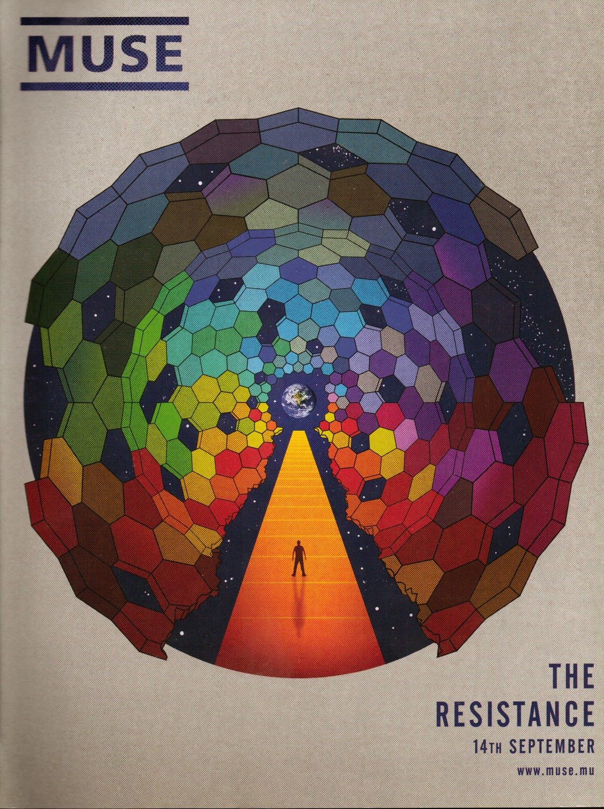
One thing that is apparent immediately here is how little is on the poster. There is a large image, the band's logo in bold, the name of the item in bold as well as the date of release and the band's website noted at the bottom. The lack of 'clutter' does make the poster quite eye-catching; it is quick to look at and doesn't take up so much time as a poster with a lot of information on would which may encourage people to skip on through the magazine.
One thing that is absolutely necessary for a magazine Ad is for it to be noticeable immediately and capture it's Primary and Secondary Target Audiences. This advert is one example that will definitely be noticeable to fans of the band. Much of this is to do with the bands name and logo in the top left corner. Because it is a bold font and by itself with nothing around it, it really stands out and anchors the poster as coming from the band Muse.
 |
| "The Resistance" Album Cover |
Something significant about this poster is that it is almost identical to the album cover, with the date of release and the Muse website information added. Whether this is a common thing in the industry I am not sure and hopefully will discover by looking at further examples. Even though I am not sure whether it is something that occurs throughout the business, I do think the idea of having the Magazine Ad the same as the album cover is good as it directly links the product and means the customer knows what they are looking for when trying to buy the product once it comes out. Though it may not work in every genre, I think it is an effective idea for this particular genre.
One thing that has to be noticed from looking at this poster is the lack of unnecessary information. The design does not include anything unnecessary and provides basic information; this both keeps some sort of mystery about the album as well as not overpowering the reader with information. For our own magazine ad this is something that we could look into, although we need to demonstrate a number of skills. This could be quite a challenge, though if done correctly could look very effective and professional.
No comments:
Post a Comment
All comments are moderated.