Even though our idea has changed quite drastically over time, a couple of things have stayed the same. These include the basic idea of a 'muse nerd' been lonely and depressed and the settings that we have intended to use. Right from the beginning we had ideas of where we could shoot and ideas for scenes in these settings and although our idea has changed over the course of the task, we feel that we can adapt the ideas at these settings to suit any new idea.
Scenes at School  Due to the age of the protagonist and our target audience, as well as taking influence from other music videos and films, we decided that we wanted part of our video to be taken at school. The film "Breakfast Club" and the music video for Pearl Jam's "Jerimiah" were big influences for these scenes, with a number of ideas coming from watching these. Settings looked at as ideas for scenes in the school include:
 - In the school sixth form center
- In a corridor next to some lockers
- On a staircase with two 'bullies' walking past the 'muse nerd'
With developments to our ideas we are now unlikely to use most of what we have filmed at school. An example of this is the scene on the staircase. As part of the earlier idea we looked into this as a potential setting and somewhere where we could show dominance of the two 'bullies' over our protagonist. With the change in idea and the eradication of the bullying idea, this scene will now not be used. It does however still show that we have looked into potential settings and filmed footage to 'test out' our ideas.
Scenes in Ilkley Town
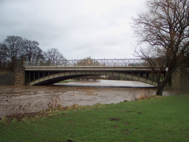 |
| Main Bridge in Ilkley |
From the start of the course it was always our intention to film some scenes in Ilkley due to the wide range of potential settings and mise-en-scene. The following locations have been looked at as possible settings for scenes in our video, and have all at some point had sample footage recorded there.
- Down by the river on the pebble beach
- On the Main Bridge in Ilkley, just up from the pebble beach.
- We also tried a very different idea on the same MainBridge with the attempted suicide scene at the end. This was very different to the other ideas for on the bridge, though in the end we decided on using a different setting.
- Ilkley Skate Park
- On the rugby field
- On a different pebble beach further down the river where the protagonist is looking up at the Swing Bridge.
- On the Swing Bridge where we filmed a different suicide scene
The majority of these scenes are now likely to be included in our final piece. Many of the settings have been looked at in the sample footage and we have decided that, with improvements they may work well and we have now re-filmed in these places.
Scenes in Addingham Village
As well as the footage that we have taken in Ilkley, we felt that we could have more variation by filming in the village of Addingham which would give us an increased amount of settings for scenes to choose from. Scenes and ideas that we looked at and filmed as sample footage in Addingham include:
- Footage from the underground tunnel
- The protagonist playing football on the street in the snow
- In the local park with the protagonist alone
- On the moorside
- Down by the stream in a wooded area
- At the bus stop
- On the football pitch
As with Ilkley, most of these settings will be taken and used in the final footage. The reason to scout these scenes and film sample footage here was to get an idea of whether these settings worked and to try and gain ideas for framing. Once this was done, we could re-film and use this footage in these settings for our final product.
On the Bus
The scenes that we shot on the bus were fairly ambitious and challenging, though we felt we had nothing to lose in shooting these scenes; if they worked then we could include them in our final piece and if they failed they could simply be deleted. Challenges included holding a camera steady on the bus which at times proved impossible but also ensuring that we didn't catch people who were unwilling to be filmed in the shots, whilst still making it look like other people were on the bus. We managed this by including other members of the group in the shot so that it looked like other people were on the bus, but we didn't have any problems regarding permission.